

With the problems we know about with Apple's Gamma Shift, it's difficult for us to understand and know what to do when sending to customers or posting online, depending on the browser, screen, Mac Studio, MacBook, iPhone, etc.
Personally, I use two LUTs.
I avoid using REC-709-A.
Here are my settings :
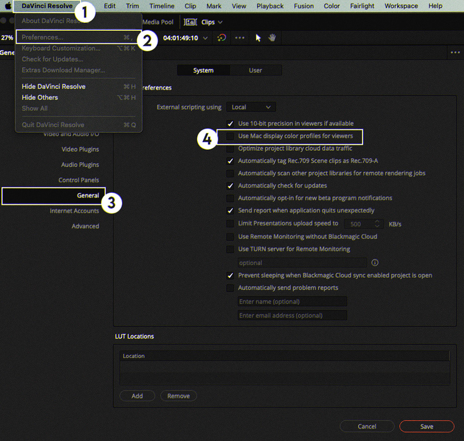
DaVinci Resolve - Preferences - General - Uncheck "Use Mac Display Color For Viewers"
(If you're using a external display) (If you're using I/O)
Project Settings
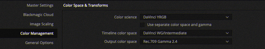
(Gamma 2.4 or Gamma 2.2 (it depend of your project))
But obviously, even with an I/O, there will ALWAYS be gamma shift with Apple.
But I've found a pretty cool solution to avoid this issue between clients and colorists.
I tell clients about the gamma shift problem and that I apply a LUT for the client preview (depending on whether they use a MacBook or Mac Studio). If they use a Windows computer, there's no problem with gamma shift.
Officially, you should follow what you see on DaVinci Resolve. But let's be honest, clients watch either on Quicktime, on their phone, or on an Apple tablet.
So we need to fix this little problem.
Here's how I see it.
For the client preview, send the work explaining the problem and add one of the two LUTs I'm showing you.
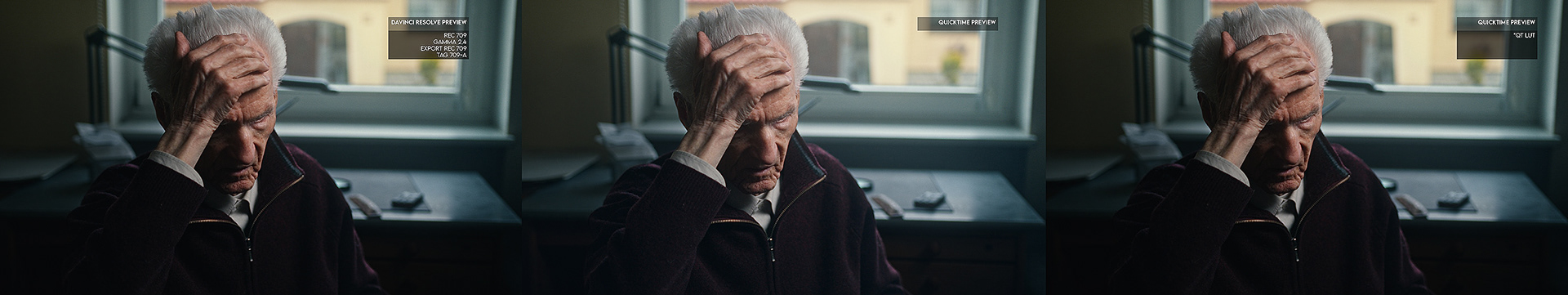
Here we can see three renderings: two renderings on Quicktime, one rendering on the Video Village Screen application, and the last one, which we see directly on Davinci Resolve.
The rendering on Quick Time (No Lut) is lifted, the gamma is lifted, which is a problem. But it's not wrong! Because it's Apple that applies a gamma correction.
With the LUT *QT-MacStudio, you can see that it is very close to the actual rendering.
---
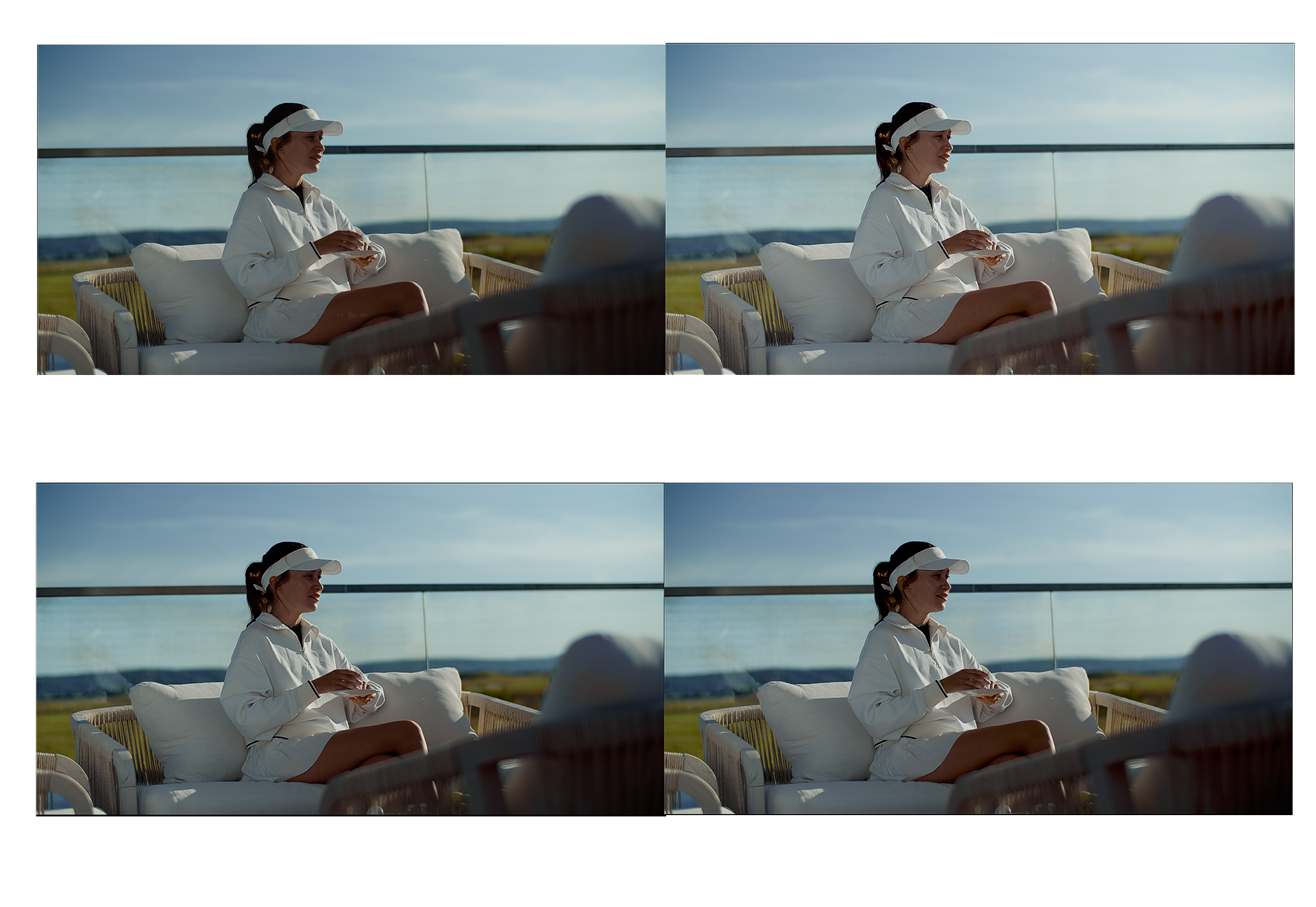
But in any case, what you see through the Ultra Studio Monitor 3G will be different when you switch back to not using the Ultra Studio Monitor 3G.
Let's say that the Ultra Studio Monitor 3G serves as a “middle ground,” for example.
With the Ultra Studio M, my image is just how I want it. Once I switch to the version WITHOUT the Ultra Studio M, the image seems slightly more contrasted, and when I view it with Quicktime, it appears slightly brighter, but it's still a compromise.
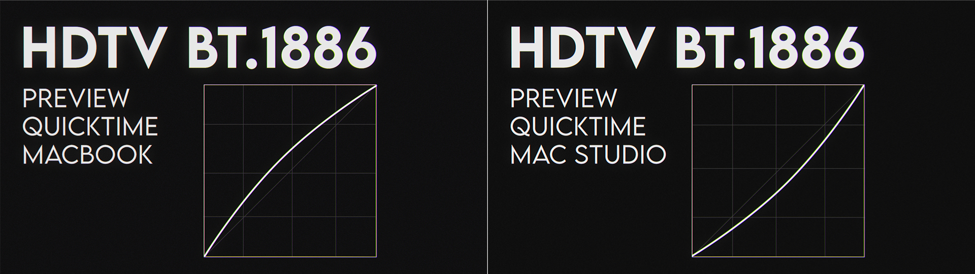
The curves are for illustrative purposes only and are not representative of reality.
One LUT is designed for the Mac Studio (if you are using an EXTERNAL display).
The other is designed for MacBook (with the “HDTV VIDEO (BT.709-BT.1886)” preset.
-
Otherwise, you can always try previewing in sRGB.
---
Recommandation :